<img height="1" width="1" style="display:none" src="https://www.facebook.com/tr?id=632467893568299&amp;ev=PageView&amp;noscript=1">

Welcome to the Throwdown Brand Framework

The Throwdown Brand Framework defines how Throwdown shows up everywhere it lives—from product and design to language and experience. It clarifies who we are, what we stand for, and how decisions get made, so the brand always feels bold, focused, and intentional.

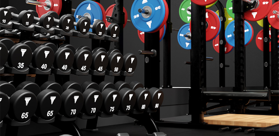
Throwdown was built for training that doesn’t flinch. Born from competitive roots and forged in high-intensity environments, the brand exists to support athletes who show up to work—day after day, rep after rep. This isn’t about comfort or shortcuts. It’s about power, grit, and the mindset required to push past limits. Throwdown doesn’t promise easy wins—it delivers the tools to earn them.

The framework brings together Throwdown’s archetype, which shapes its confident, no-nonsense personality; a brand promise grounded in durability, performance, and real training outcomes; a visual and tonal direction that reflects strength, aggression, and purpose; and clear guidelines that help teams apply the brand consistently across every touchpoint.

Together, these elements align strategy, design, and messaging so Throwdown always feels authentic and uncompromising—whether you’re launching something new or evolving what already exists. This framework is here to create clarity, eliminate guesswork, and ensure everything we build reflects the relentless spirit at the heart of Throwdown.

StairMaster 8Gx with Touchscreen and Woman Interacting with the Screen.

Brand Positioning Archetype - Throwdown

Tone and Taglines

Throwdown represents a powerful fusion of the Hero and Creator archetypes — a brand built on authenticity, grit, personal transformation, and the electrifying energy of collective effort. 

  • Voice: Throwdown champions both the raw, emotional roots of functional training and the modern, community-driven movement redefining the category today.

  • Look & Feel: The visual expression should feel intense but human, bold but inviting, competitive yet inclusive — a balance of impact and innovation.

Tagline Inspiration

  • “Built For Impact. Designed For Evolution.”
  • “Real Training. Real People. Real Results.”
  • “Where Grit Meets Community.”
  • “This Is Functional Fitness — Redefined.”
  • “Your Journey. Our Space.”
  • “Strong Alone. Unstoppable Together.”
  • “The New Standard In Functional Performance.”

Visual Mood Board Layout - Throwdown

Visual Layout Framework

Use a modular grid layout divided into five sections, each representing one pillar of the Core identity: Partnership, Design, Innovation, Global Scale, and Excellence.

Section

Visual Focus

Discription

Intensity

High Contrast, Raw performance moments

Capture the true feeling of functional training. Sweat, strain, grit, breath. Show emotion and effort and personal goals. Stark directional lighting emphasises Hero energy.

Innovation

Modern functional fitness + new-gen performance culture.

Showcase the evolution of functional fitness: HYROX-style competitions, modular rigs, efficient layouts, colour-accented zones. Represents Throwdown as forward-thinking and future-ready.

Belonging

Community, team energy, shared moments

Display authentic camaraderie: group classes, high-fives, partner workouts, post-set celebration. Cool-toned lighting supports the Creator’s “collective energy”.

Realism

Raw details + imperfect edges

Focus on tactile reality — chalk marks, scuffed floors, sweat droplets, grip textures. Highlights the roots of functional fitness and the Hero’s authenticity.

Space Intelligence

Smart layouts, inviting functional zones

Emphasise space-saving rigs, clear training zones, colour cues, and modern gym flow. Communicates Throwdown’s reliability as a one-stop provider that delivers efficient, inviting spaces.

Logo Use

MAXIMUM SIZE and CLEARANCE

The minimum width of each logo is 1.5” (4 cm). The minimum clearance around the logo is illustrated below. Maintaining the designated clear space around the logo maintains the integrity of the logo and ensures it will not be crowded by other text and design elements.

LINK TO LOGOS IN CORE CONTENT HUB

Screenshot 2026-03-04 at 3.42.17 PM


Color Palette and Material Reference

Primary Palette:

  1. Throwdown Red (#ed1b2e)
  2. Rich Black (#000000)
    1. Rich Black at 30%
    2. Rich Black at 10%

Screenshot 2026-03-04 at 3.42.21 PM

Material Mood:

  • Materials should evoke competition, durability, and function:

  • Matte black steel (rigs, frames — dependability)

  • Textured rubber flooring (impact + authenticity)

  • Powder-coated hardware with electric blue accents (modernity)

  • Tactical fabrics + perforated mesh (breathability + toughness)

  • LED lighting in blue or soft white (inviting but high-performance atmosphere)


Imagery Style and Photographic Direction

Lighting

  • Hero lighting: High contrast, deep shadows, dramatic front or side lighting.

  • Creator lighting: Cooler tones, diffused overhead light, glowing accent colors. Use lighting to switch between “raw grit” and “modern community”.

Composition

Hero shots:

  • Tight crops on effort — facial grit, muscle tension, rope movement

  • Low angles to exaggerate power

  • Mid-action freeze frames

  • Creator shots:

  • Wider compositions

  • Multiple athletes, shared spaces

  • Natural, authentic smiles or celebration moments

Motion

Throwdown should capture movement without perfection: Ropes blurring, chalk dispersing, sweat flying, feet leaving the floor.

Texture Detail Shots

  • Rig welds, attachment points, flooring textures

  • Handles, grips, punchbags

  • Evidence of real use: chalk marks, scuffs, sweat sheen

These visuals reinforce “built for impact” and “true functional fitness”.

Screenshot 2026-03-04 at 3.47.27 PM


Typography and Graphic Elements

Typography:

  • Primary Font: Helvetica
  • Headlines: Helvetica Bold Headlines
  • Body Copy: Helvetica Medium or Light 

Graphic Overlays/Language:

  • Angular shapes referencing rig structure
  • Yellow or blue diagonal accent lines to mimic movement
  • Minimalist metrics (e.g., “POWER / DRIVE / IMPACT”)
  • Thin-line frames around individuals or equipment to represent structure + creativity

Layout Recommendation

For digital or presentation use (e.g., Adobe XD, Canva, Miro):

Row 1: Archetype Contrast:

  • Left: Raw emotional Hero imagery

  • Right: Modern, colourful Creator community scene

Row 2: Product / Rig Detail Grid

  • 3–5 close-ups of rigs, grips, rigs with colour accents, flooring

Row 3: Space Design

  • Inviting functional zones, colour accents, space-smart planning

Row 4: Lighting / Texture Palette

  • Black, blue, yellow contrast

  • Lighting references

  • Material samples

Row 5: Copy & Typography

  • Headlines, subtext styles, metric-style overlays

Screenshot 2026-03-04 at 3.47.18 PM


Summary

Your Throwdown mood board should tell one clear narrative:

  • Throwdown is the evolution of functional fitness — raw, real, and emotionally charged, yet modern, community-driven, and intelligently designed.

It merges:

  • The Hero’s grit and personal intensity
  • with the Creator’s energy, community, and innovation

Throwdown stands as the one-stop functional fitness provider that delivers impact, belonging, and the future of performance environments.


Throwdown's Social Accounts