<img height="1" width="1" style="display:none" src="https://www.facebook.com/tr?id=632467893568299&amp;ev=PageView&amp;noscript=1">

Welcome to the Stairmaster Brand Framework

The StairMaster Brand Framework is the foundation for how StairMaster shows up in the world. It defines who we are, what we stand for, and how we make decisions—so the brand feels clear, confident, and instantly recognizable wherever it appears.

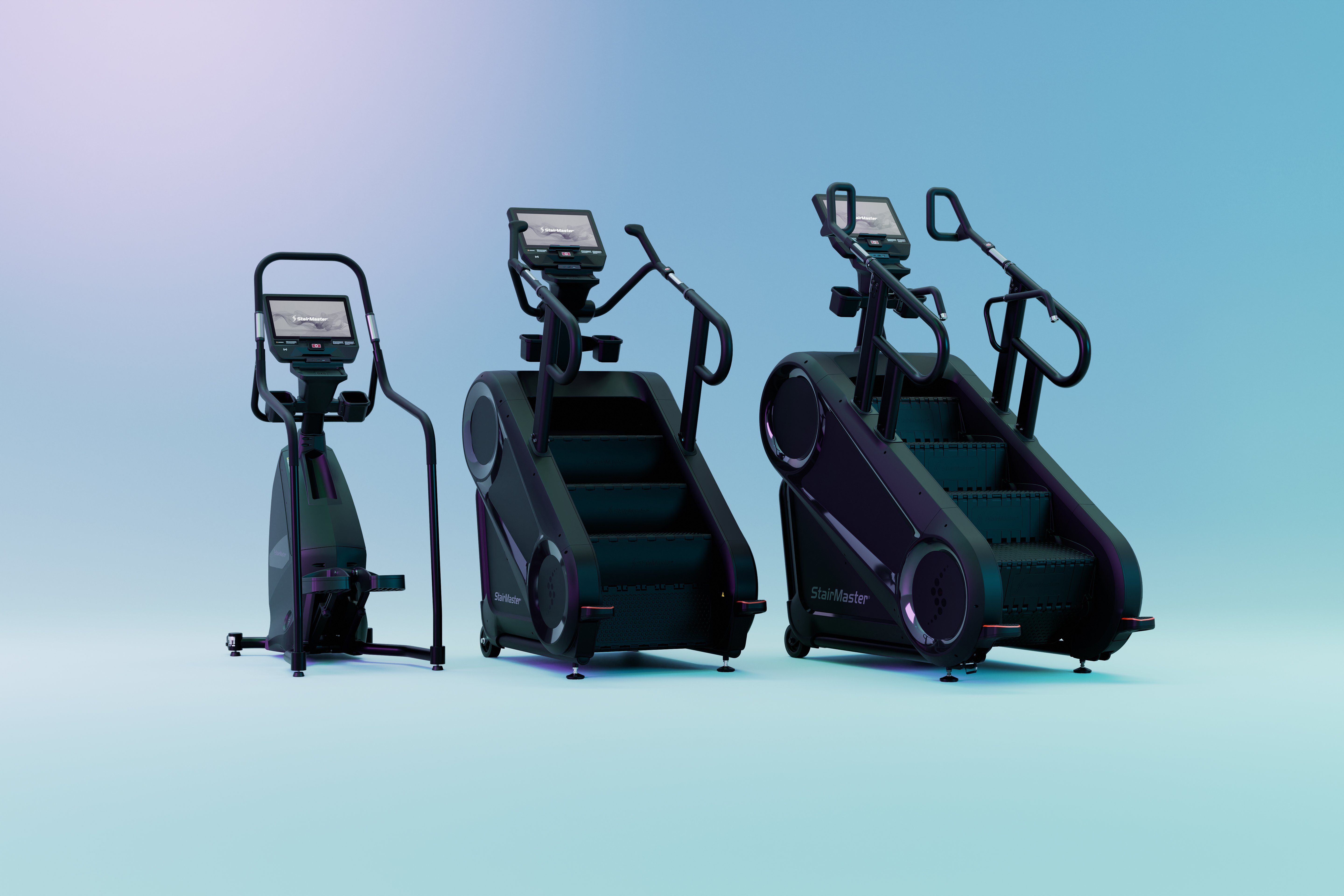
For more than four decades, StairMaster has been shaping the human experience through an unmatched workout that delivers real results. Through climbing, people have connected with StairMaster and Jacobs Ladder to push heart rates higher and burn calories faster with products known for being “easier to work harder on.” StairMaster is the workout everyone loves to hate—and that truth sits at the core of the brand. It’s honest, demanding, and earned, not hyped.

The framework brings together StairMaster’s archetype, which defines that tough-but-respected personality and point of view; our brand promise, which sets clear expectations around performance and results; a mood and visual direction that reflects intensity, grit, and purpose; and practical guidelines that help teams apply the brand consistently across every channel and touchpoint.

Together, these elements align strategy, design, and messaging so StairMaster always feels intentional and true—whether you’re creating something new or building on what already exists. This framework is here to remove guesswork, create alignment, and help everyone bring the StairMaster brand to life in a way that feels authentic, cohesive, and unmistakably StairMaster.

StairMaster 8Gx with Touchscreen and Woman Interacting with the Screen.

Brand Positioning Archetype - StairMaster

Tone and Taglines

Tone & Expression: StairMaster embodies the Outlaw and Hero archetypes — raw intensity, fearless determination, and the relentless pursuit of greatness.

  • Voice: Raw intensity, fearless determination, and the relentless pursuit of greatness.

  • Look & Feel: The visual expression should feel gritty yet inspiring, industrial yet aspirational. Every element should communicate that StairMaster is not just a workout — it’s a rebellion against comfort and a climb toward mastery.

Tagline Inspiration

  • NO COMFORT. ONLY CLIMB.”
  • “BREAK THE RULES.”
  • “EARN EVERY STEP.”
  • “PAIN BUILDS POWER.”
  • “RISE ABOVE.”
  • “BUILT TO CHALLENGE.”

Visual Mood Board Layout - StairMaster

Visual Layout Framework

Use a modular grid layout divided into five sections, each representing one pillar of the Core identity: Partnership, Design, Innovation, Global Scale, and Excellence.

Section

Visual Focus

Description

Intensity

Athletes in motion, sweat, and effort

Capture real, unfiltered moments of determination. Lighting should emphasize muscle tension, grit, and movement.

Challenge

Climb imagery, elevation, and struggle

Highlight ascent — steps, stairs, and upward momentum. Use dramatic contrast to symbolize effort leading to victory.

Rebellion

Industrial and urban environments

Warehouse, rooftop, or concrete backdrops. Textures of steel, brick, and sweat. Reflect defiance, individuality, and authenticity.

Triumph

Heroic moments and energy

Show achievement through expression and light. Post-workout exhale, hands on knees, the glow of accomplishment.

Legacy

Iconic StairMaster products

Product hero shots that communicate engineering strength and performance heritage — the stair as both challenge and icon.

Logo Use

MAXIMUM SIZE and CLEARANCE

The minimum width of each logo is 1.5” (4 cm). The minimum clearance around the logo is illustrated below. Maintaining the designated clear space around the logo maintains the integrity of the logo and ensures it will not be crowded by other text and design elements.

LINK TO LOGOS IN CORE CONTENT HUB

Screenshot 2026-03-04 at 10.33.40 AM

Screenshot 2026-03-04 at 10.33.51 AM

Do NOT use these logos

Screenshot 2026-03-04 at 10.32.54 AM


Color Palette and Material Reference

Primary Palette:

  1. StairMaster Purple (#510c76)
  2. Rich Black (#000000)
    1. Rich Black at 30%
    2. Rich Black at 10%

Screenshot 2026-03-04 at 10.33.59 AM

Material Mood:

  • Brushed and powder-coated steel (durability + grit)
  • Concrete and rubber flooring (industrial authenticity)
  • Smoked glass or LED console light (tech edge)
  • Matte black finishes (discipline + dominance)


Imagery Style and Photographic Direction

Lighting:
Low-key lighting with hard edges and directional shadows.
Use light to frame intensity — beams cutting through darkness or spotlights highlighting climbers mid-effort. Avoid studio brightness; embrace raw contrast.

Composition:
Dynamic framing emphasizing vertical motion — from ground to summit.
Strong diagonals and off-center balance create a sense of climb and defiance.
Allow negative space to symbolize freedom and personal challenge.

Texture Detail Shots:
Close-ups of moving steps, foot placement, knurled handrails, and LED glow.
Show wear, sweat, and durability — signs of use as proof of performance.


Screenshot 2026-03-04 at 9.02.10 AM

Screenshot 2026-03-04 at 9.02.37 AM


Typography and Graphic Elements

Typography:

  • Primary Font: Helvetica
  • Headlines: Helvetica Bold Headlines
  • Body Copy: Helvetica Medium or Light 

Graphic Overlays:

  • Angular motion lines, step gradients, or light trails suggesting upward movement.
  • Distressed overlays or faint grit textures to maintain authenticity.
  • Minimal but impactful data or word overlays (“WATTS,” “STEPS,” “CLIMB TIME”) to reinforce performance metrics.

Layout Recommendation

For digital or presentation use (e.g., Adobe XD, Canva, Miro):

  • Row 1: Hero inspiration — athlete mid-climb, raw motion + tagline overlay.
  • Row 2: Intensity and Challenge grid (3–4 motion and close-up shots).
  • Row 3: Material and color swatches (steel, concrete, LED glow).
  • Row 4: Typography and graphic overlay references.
  • Row 5: Copy inspiration with bold statements and light burst imagery.

Screenshot 2026-03-04 at 9.02.22 AM

Screenshot 2026-03-04 at 9.02.45 AM


Summary

Your visual board should tell one clear story:
StairMaster is not for everyone — it’s for those who rise.

Every visual should reflect resistance, progression, and transformation.
The design should feel raw but disciplined, gritty but elevated — capturing the emotional journey from effort to triumph.

The StairMaster experience is a test of will, not a display of comfort. It’s where rebellion meets results — and where every climb becomes a statement.


StairMaster's Social Accounts