<img height="1" width="1" style="display:none" src="https://www.facebook.com/tr?id=632467893568299&amp;ev=PageView&amp;noscript=1">

Welcome to the Schwinn Brand Framework

The Schwinn Brand Framework defines how Schwinn shows up across every rider touchpoint—from bike design and instructor programs to language, content, and studio experience. It clarifies who we are, what we stand for, and how decisions are made so the brand consistently feels energetic, motivating, and rooted in authentic cycling culture.

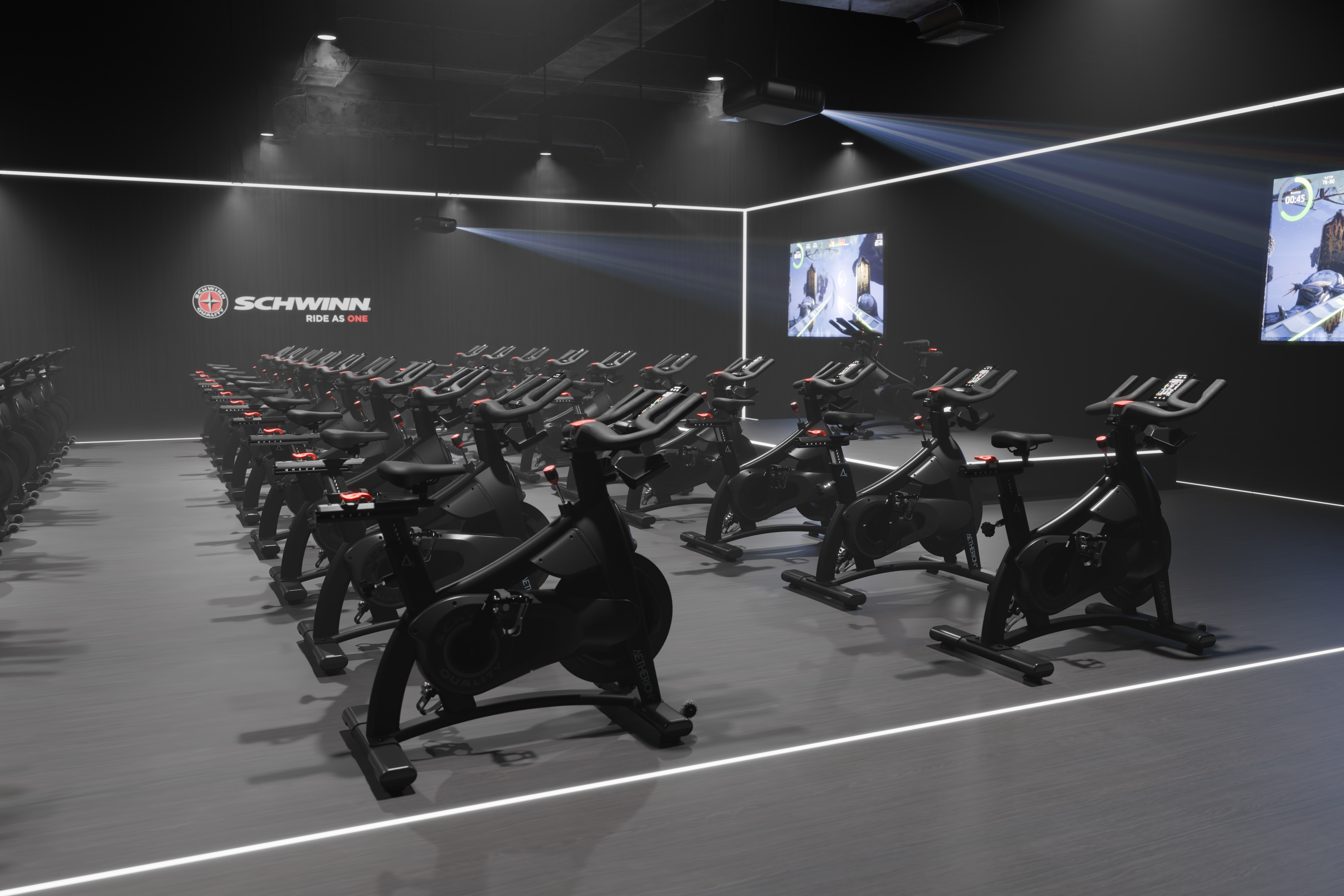
Schwinn has been part of the cycling world for more than a century, and its indoor cycling legacy is built on bringing the power and rhythm of the ride into the studio. From the earliest group cycling programs to today’s connected training environments, Schwinn indoor cycling has helped riders of all levels find their pace, build strength, and experience the shared energy that happens when a room moves together.

This isn’t just about pedaling a bike. It’s about the feeling of the ride—music, momentum, coaching, and community coming together to create an experience that keeps riders coming back. Schwinn indoor cycling exists to support instructors, motivate riders, and make every class feel like a powerful, purpose-driven ride.

The framework brings together Schwinn’s archetype, which shapes its motivating and inclusive personality; a brand promise focused on performance, reliability, and engaging ride experiences; a visual and tonal direction that reflects motion, rhythm, and energy; and clear guidelines that help teams apply the brand consistently across bikes, studios, and digital content.

Together, these elements align product, programming, and storytelling so Schwinn indoor cycling always feels authentic, motivating, and built for the ride—whether introducing new riders to the studio or helping experienced cyclists push to the next level.


StairMaster 8Gx with Touchscreen and Woman Interacting with the Screen.

Brand Positioning Archetype - Schwinn

Tone and Taglines

Schwinn embodies the Lover and Explorer archetypes — a blend of passion, connection, and adventure.

  • Voice: Every element should communicate that Schwinn is more than a ride — it’s an experience that moves people, together.

  • Look & Feel: The visual expression should feel immersive, rhythmic, and emotionally charged, celebrating the shared joy of movement and the community born through indoor cycling.

Tagline Inspiration

  • “RIDE TOGETHER. FEEL THE RHYTHM.”
  • “CONNECTED BY MOVEMENT.”
  • “PASSION POWERS EVERY PEDAL.”
  • “FIND YOUR BEAT. FEEL ALIVE.”
  • “THE ENERGY STARTS HERE.”

Visual Mood Board Layout - Schwinn

Visual Layout Framework

Use a modular grid layout divided into five sections, each representing one pillar of the Core identity: Partnership, Design, Innovation, Global Scale, and Excellence.

Section

Visual Focus

Description

Connection

Groups riding together, instructors leading

Capture the emotional energy of shared effort — smiles, focus, movement in sync. Use natural warmth and human closeness.

Rhythm

Light, motion, and color

Blur, streaks, and lighting that convey tempo and flow. Symbolize music, sweat, and connection through kinetic photography.

Experience

Studio atmosphere and sensory immersion

Showcase glowing consoles, ambient lighting, and the feeling of being “in the moment.” Use rich color tones and soft light flares.

Freedom

Individual riders lost in focus

Capture the joy of motion — wind-swept hair, eyes closed, total presence. Evoke the freedom of the ride, indoors or out.

Passion

Instructor energy and member emotion

Highlight the human heartbeat of the brand — inspiring leaders, passionate expressions, and community celebration.

Logo Use

MAXIMUM SIZE and CLEARANCE

The minimum width of each logo is 1.5” (4 cm). The minimum clearance around the logo is illustrated below. Maintaining the designated clear space around the logo maintains the integrity of the logo and ensures it will not be crowded by other text and design elements.

LINK TO LOGOS IN CORE CONTENT HUB

Screenshot 2026-03-05 at 1.24.20 PM


Color Palette and Material Reference

Primary Palette:

  1. Schwinn Red (#ed1b2e)
  2. Rich Black (#000000)
    1. Rich Black at 30%
    2. Rich Black at 10%

Screenshot 2026-03-04 at 3.42.21 PM

Material Mood:

  •  Brushed aluminum (durability + quality)
  • Matte black (focus + sophistication)
  • Ambient red lighting (passion + energy)
  • Warm textures (sweat, skin, fabric) for authenticity and intimacy

Screenshot 2026-03-05 at 1.28.27 PM


Imagery Style and Photographic Direction

Lighting:

  • Use warm, enveloping light to create connection and emotion.
  • Blend studio ambience (red and amber tones) with natural diffusion for a cinematic look.
  • Prioritize human energy over product gloss — the glow of effort and community.

Composition:

  • Center and close-up framing to emphasize emotion and connection.
  • Use shallow depth of field to focus on faces, hands gripping handlebars, or beads of sweat — tactile storytelling.
  • For Explorer elements, incorporate motion blur, lens flares, and dynamic camera angles to evoke adventure and momentum.

Texture Detail Shots:

  • Bike flywheels, handlebars, LED reflections, and instructor mic bands.
  • Lighting gradients across metal frames and human skin — heat and energy personified.

Screenshot 2026-03-05 at 1.28.05 PM


Typography and Graphic Elements

Typography:

  • Primary Font: Helvetica
  • Headlines: Helvetica Bold Headlines
  • Body Copy: Helvetica Medium or Light 

Graphic Overlays/Language:

  • Flowing lines, circular gradients, and soft glow overlays to evoke rhythm and energy.
  • Use subtle red or coral motion trails to symbolize connection and tempo.
  • Minimal data overlays (RPM, TIME, BEAT) can emphasize community metrics in a stylish, non-technical way.
  •  
  •  
Layout Recommendation

For digital or presentation use (e.g., Adobe XD, Canva, Miro):

  • Row 1: Hero inspiration — instructor leading class + glowing light and motion blur.
  • Row 2: Connection and Rhythm grid (4–5 community and motion shots).
  • Row 3: Color and texture palette (red lights, warm tones, studio elements).
  • Row 4: Typography and soft gradient overlays.
  • Row 5: Copy inspiration with movement-driven taglines and emotional imagery.

Screenshot 2026-03-04 at 3.47.18 PM


Summary

Your visual board should tell one clear story:
Schwinn is the heartbeat of indoor cycling — where connection, rhythm, and emotion come to life.

Every visual should pulse with energy and authenticity, merging the Lover’s emotional depth with the Explorer’s spirit of freedom.
The design should celebrate both community and individuality, creating a sensory experience that transcends the ride.
It’s not just about fitness — it’s about feeling alive together.

Schwinn's Social Accounts