
.png)
.png)
.png)
.png)


Visual Layout Framework
Use a modular grid layout divided into five sections, each representing one pillar of the Core identity: Partnership, Design, Innovation, Global Scale, and Excellence.
|
Section |
Visual Focus |
Description |
|
Precision |
Macro product details (cams, levers, plates) |
Close-up photography showcasing craftsmanship and biomechanical innovation. Use sharp contrast and directional lighting. |
|
Performance |
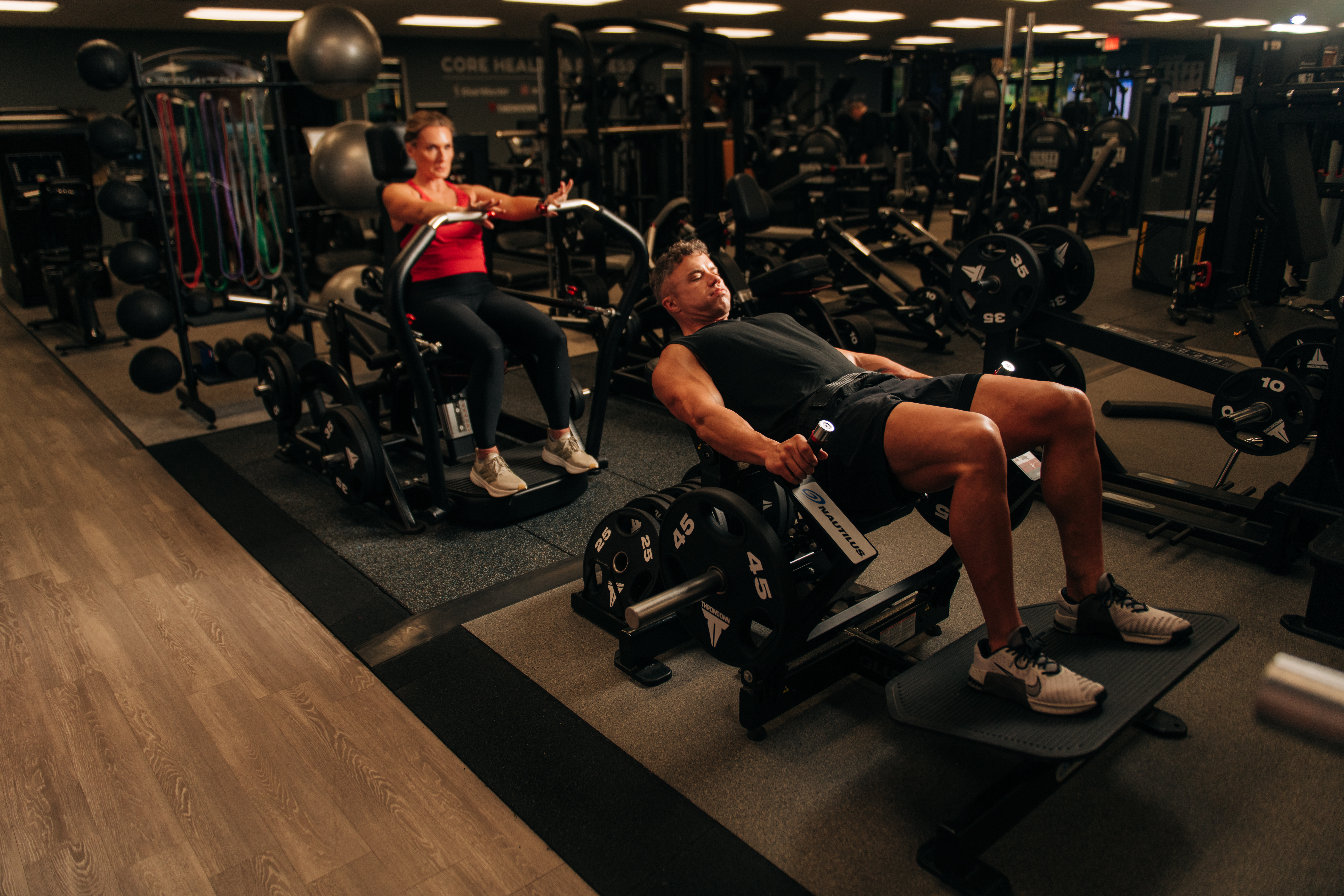
Athletes in form, not flair |
Images of lifters mid-rep, demonstrating smooth motion and control. Lighting highlights muscle engagement and motion arcs. |
|
Legacy |
Monochrome brand heritage |
Archival Nautilus imagery subtly blended with modern iterations to symbolize evolution, not nostalgia. |
|
Design |
Material and color texture |
Steel, matte black, graphite, and silver tones arranged in minimalist gradients. Use subtle blue accents as brand identifiers. |
|
Human Form |
Education and empowerment |
Depictions of trainers coaching, members learning, and users experiencing progress — strength through understanding. |
Logo Use
MINIMUM SIZE and CLEARANCE
The minimum width of each logo is 1.5” (4 cm). The minimum clearance around the logo is illustrated below. Maintaining the designated clear space around the logo maintains the integrity of the logo and ensures it will not be crowded by other text and design elements.
LINK TO LOGOS IN CORE CONTENT HUB


Do NOT use these logos
![]()
Color Palette and Material Reference
Primary Palette:
- Nautilus Blue (#4072B8)
- Rich Black (#000000)
- White (#FFFFFF)
- Grey (#5C5B5B)
- Gradient (C2C3C0/EFEFEE)

Material Mood:
- Brushed steel texture (polished but not reflective)
- Carbon fiber pattern (control + speed)
- Soft-touch rubber (comfort + durability)
- Clean concrete floor tone (industrial precision)
Imagery Style and Photographic Direction
Lighting:
Natural and directional light that enhances structure and depth. Use warm undertones for human connection and cooler tones for equipment precision.
Composition:
Balanced symmetry that communicates order, stability, and intentional design. Include negative space to highlight hierarchy and focus.
Texture Detail Shots:
- Brushed metal frames, welded joints, digital consoles, and layout blueprints.
- Architectural details (lines, grids, elevations) symbolizing the structured creativity of Core’s ecosystem.

Typography and Graphic Elements
Typography:
- Primary Font: K2D/Obvia Condensed
- Headlines: K2D Bold Italic/K2D Italic
- Body Copy: Obvia Condensed Regular
Graphic Overlays:
- Subtle grid lines or motion arcs to represent biomechanics.
- Transparent layers with data-inspired motifs (charts, load curves, or movement maps).
Layout Recommendation
For digital or presentation use (e.g., Adobe XD, Canva, Miro):
- Row 1: Hero inspiration — product + athlete dual image.
- Row 2: Precision macro photography grid (3-4 close-ups).
- Row 3: Material and texture swatches.
- Row 4: Typography and color palette reference.
- Row 5: Copy inspiration with tagline overlays.
Summary
Your visual board should tell one clear story: Nautilus is strength perfected through biomechanics, or science. Every visual should reflect precision, control, and authority. The design is not loud; it’s intentional — built to mirror the intelligence behind every movement and every machine.
(Biomechanics is the science of the body's movement through space or multiple planes.)

- The sagittal plane divides the body into left and right halves for forward and backward movements like lunges and bicep curls.
- The frontal plane divides the body into front and back halves for side-to-side motions like arm raises and leg raises.
- The transverse plane divides the body into top and bottom halves for rotational movements like a twisting motion or a wood chop.


