<img height="1" width="1" style="display:none" src="https://www.facebook.com/tr?id=632467893568299&amp;ev=PageView&amp;noscript=1">

Welcome to the GymRax Brand Framework

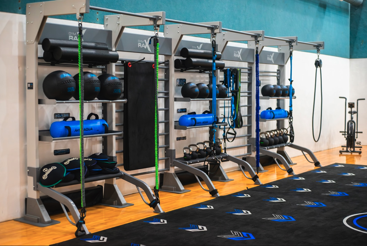
The GymRax Brand Framework is the foundation for how GymRax shows up in the world. It defines who we are, what we stand for, and how we make decisions so the brand feels clear, confident, and consistent wherever it appears.

The framework brings together our brand promise, which sets expectations for delivering premium, space-efficient, and highly functional training environments; a mood and visual direction that expresses that strategy through a sleek, professional, and industrial-strength aesthetic; and clear guidelines that help teams apply the brand consistently across every modular configuration and physical space.

Together, these elements align strategy, design, and messaging so GymRax always feels intentional and recognizable whether you are creating a new custom layout or building on existing storage systems. This framework is here to remove guesswork, create alignment, and help everyone bring the GymRax brand to life in a way that feels authentic, cohesive, and unmistakably GymRax.

Screenshot 2026-04-21 at 10.44.29 AM
Logo Use

MAXIMUM SIZE and CLEARANCE

The minimum width of each logo is 1.5” (4 cm). The minimum clearance around the logo is illustrated below. Maintaining the designated clear space around the logo maintains the integrity of the logo and ensures it will not be crowded by other text and design elements.

LINK TO LOGOS IN CORE CONTENT HUB


Color Palette and Material Reference

Primary Palette:

  1. Star Trac Red (#3cf6ca)
  2. Dark Grey (#162028)
  3. White (#ffffff)


    Screenshot 2026-04-17 at 10.54.28 AM


Material Mood:

  • Polished Glass and High-Gloss Displays (Innovation + Clarity)
  • Deep Charcoal and Midnight Obsidian (Depth + Premium Tech)
  • Anodized Aluminum and Cool Steel (Stability + Scalability)
  • Dynamic Light Trails and Glow Effects (Energy + Motion)
  • Perforated Textures and Breathable Synthetics (Performance + Integration)


Imagery Style and Photographic Direction

Lighting:
Directional, high contrast with defined shadow edges to emphasize form and depth. Avoid overexposure or soft ambient tones — clarity communicates intelligence.

Composition:

  • Center-weighted subjects for authority and balance.
  • Geometric framing that reflects emotion.
  • Negative space for hierarchy and focus.

Texture Detail Shots:
Close-ups of people interacting with Wexer.

Screenshot 2026-04-17 at 11.04.51 AM


Summary

The Wexer visual board should tell one clear story: Wexer empowers every fitness business to thrive in the digital age — whether they are engaging members in-studio or on the go.

Every visual should balance innovation and accessibility, combining the Magician’s transformative technology with the Sage’s reliable expertise.

Design should communicate that Wexer is the digital ecosystem built for the modern, hybrid fitness world — visionary, seamless, and results-driven.

GymRax's Social Accounts

Explore our House of Brand Frameworks

Core Health & Fitness is home to the most memoriable brands in the fitness industry. Follow the links below to learn about each Brand Framework and gain access to content and resources.